Sunday, November 25, 2012

Asterios Polyp by David Mazzucchelli

     The book is interesting both visually and story-wise. I was really impressed by the unique style the author used throughout the book. The style of art changes from time to time, each time fitting into the story nice and smoothly. Small things such as the color of the panels, shape of the bubbles, even the text varies from person to person. His creative ideas are not only carried out by the story, but it's also embedded in the art itself. I think of this piece of work as "design" over a illustrated narrative. Due to the fact, the art probably told me much more than the text did.

     Asterios Polyp, a middle age man who finally stepped on a journey to self-discovery after he had lost everything. He was particularly designed with architectural proportional lines and shapes, just like his personality. Most of the time Asterios is drawn in a profile view, his face is perfectly symmetrical as well. It's surprising to know that his face is exactly the same shape as his back head, forming an axe shape. I believe the author did this on purpose to emphasis on the existence of Asterios's twin brother, Ignazio. On the other hand, Hana who's completely different from her husband, was illustrated with sketchy hatching lines that represent her sensitive nature. She is also more round and less angular.

     Asterios's cool, clean and perfectly drawn lines versus Hana's warm, messy, but complex lines, the collision between the two different personality is like a chemical reaction. Their lines mixed into each other, Hana gets some of Aterios blue structural shapes and Asterios gets some of Hana's sketchy marks. At times when they are in argument, they will go back to their own form again. There's no doubt that the visual representation of the characters are the most unique element throughout the entire book. Not only the main character has their own style that's unique to their personality  so does the others. The massive amount of detail easily takes away my attention, everything has a meaning. It will take days to explore the whole.


Sunday, November 11, 2012

Astro Boy by Osamu Tezuka

     It's been more than ten years since I last watched Osamu Tezuka's Astro Boy on TV. It's the very first anime I ever watched and it has formed a crucial part of my childhood, ultimately leading me into a career in animation. Even today, the image of the little robot boy is still vivid in my memories. Despite the fact that I had forgotten most of the plots of the story, Osamu Tezuka had carved the character into my heart. I will always remember the pointy hair, the big eyes, and the pair of bright red boots.
   
     Astro Boy has impacted on people of my age greatly. Different forms of media of Astro Boy were made throughout the years, first from manga, to anime series, to feature films and even video games. It's simply rare to see a piece of work to remain popular for decades.


     The setting of Astro Boy is fifty years from its publication, in the year of 2003. We have already arrived at 2012, but our society haven't yet develop into how Tezuka predicted. However, it's quite obvious of his influence on today's Japan, which is turning itself step by step into a mechanize country. Now we have factories full of machines, computers and smart phones that we can literally "talk" to.  It won't be long till the arrival of the entirely robotic age. Although a robot, Astro is portrayed by Tezuka as a regular human kid. He can think and he has emotions just like anybody else. He is a living soul inside of a robotic body. Tezuka gave him a lovable character, even under the condition when robots were discriminated by the human, Astro still maintain his good heart. He greatly emphasize on the respect of life and fulfillment of the spiritual world - even for robots. That's why Astro is a cute and lovable little boy than a big guy with muscular body like superman.

     Why Tezuka choose to make Astro a robot rather than a regular human boy? In the story, he treated Astro like a human. Well,  beyond human, because he is invincible. After all, Astro is a robot, he is a weapon. However, Astro uses his power to protect rather than destruct. I believe that this is the ultimate message told by Astro Boy, great power should lie in the hands of people who wish to protect others. After the mistreatment of human, after the abandonment of his "father", Astro still choose to stand on the side with human. He loves human, even if human doesn't necessarily love him back.


Monday, October 29, 2012

Ranxerox by Tambourini and Liberatore


     Frist impression I had on the comic Ranxerox is that it's beautifully drawn. There's no doubt about the artist's drawing skills. The comic both portrays the realism of the true world while maintain the cartoony side of the imaginary world. I can see every muscle and blood vine clearly on the body. I even doubt that the comic is made with photoshop filters if it's not from the 70s. The art in a way, took away my attention from the actual content.

     The comic does the opposite of McCloud's "Understanding Comic", it looks too real. It's hard to "get involved" with the story of Ranxerox. Especially when the main character is an ugly and overly muscular manmade robot. In addition, visually appealing doesn't make the comic appealing. Due to the fact, the comic made me very uncomfortable. The realism of the drawings made me even more disgusted once I hit the violent scenes. I don't think even much of the adults can handle it. The comic overall is violent, bloody and sexual. Comparing to many of the zombie comics we have today, which also include many violent scenes, Ranxerox is even worse. That's because in my mind I consider zombies to be nonhuman, but people in Ranxerox (except Ranxerox) are real people.

     Tambourini and Liberatore depicted the worst part of human nature. It seems like the comic is not meant to be enjoyable, but rather serve as a punchbag to relief anger and desires. There's no moral in Ranxerox. While most of us were trained to hold back our angers at times when we face conflicts, Ranxerox just go ahead and solve it with his fists right away. He is free and wild because he has the power no one else can compete with. I believe that if a real human in the real world has the strength Ranxerox got, he would be more likely to use his power the same way as Ranxerox does rather than be a world saver. Overall, although the content of this comic is hard to appreciate, but it did tell us something about ourselves.

Sunday, October 28, 2012

American Born Chinese by Gene Luen Yang

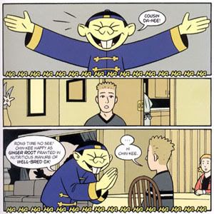
     I really enjoy the simple and relaxing style of "American Born Chinese". It's one of the few books that made me sit down and read from begin to end in one gulp. The characters designs caught my eyes right away. I can tell by the cover that this is going to be a funny book to read. There aren't too much details, just simple lines and color. The information delivers short and clearly, even though it's a thick book, but I manage to get through it in just a couple hours.

     Gene Luen Yang put the story together in a very interesting way. He made the readers travel back and forth between what seemingly unrelated stories. At first the book begins with a chapter based on the fable of Monkey King, then it suddenly switch to a totally different scene with Jin Wang, a typical Chinese American boy in school. Before I notice it, I made another jump to Danny and his Asian cousin. It's not until the end when I finally recognize that all these three stories are actually connected.

     Well, just imagine how the heck in the world does the legendary Monkey King relates to American school kids far far away in the west. They don't live in the same time period, they don't belong to the same time zone, they don't even speak the same language. Still Yang's able to weave the characters together, and the ending really gives a smack over the head.

     Yang's way of pacing out the story might be a little bit confusing at first, I felt like he just throw different short comic strips into the book randomly that doesn't make much sense. However as I read on, I realize that the story is much more than what it appears to be. It's about something we as human face constantly in our lives: who we want to be vs who we really are. Once I see the point of the story, everything makes sense.


Monday, October 8, 2012

Maus: a surviver's tale by Art Spiegelman


     As the first graphic novel to receive the Pulitzer PrizeMaus has a uniqueness which made it stands out from the rest of the comic books. It truly is an amazing work both on its symbolism and the story itself. The story is based upon a real personal experience, dating back to a dark period of human history. As students, we only had brief knowledge of the events that happened a long time from today. We read it from the textbook, the words are cold, and explanation are blurry. It's never as real as when a person who really experienced the history, teaching you the history.

     Art Spiegelman depicted the characters as animals, the symbolism used in the book is very similar to those used in the "Animal Farm" both serve the same purpose. In this case, Jews are represented by mice, which are the creatures living underground, away from the light. These symbolism are the exaggeration of different ethnicities.

     Art Spiegelman narrated the story from his point view, rather than from his father, who's the real protagonist. He told the story the exact way he heard it from his father, and invite us - the readers, to listen with him. The past and modern intertwined, shifting with one another. Thus we are constantly comparing Art's father in the past with him in the present, who survived after the Holocaust. From the beginning, Spiegelman already addressed his father's personality, he is not kind. He taught his son the cruelty of life when he was only a child. "Friends? Your friends? If you lock them together in a room with no food for a week, then you could see what it is, friends!"Just imagine, what kind of parent in the world would tell that to his son. Throughout the book, this unfriendly character of the father start to show more and more clearly. He always think that his wife is watching for his money, he didn't trust anybody, he save as much as he can - just like the way he did during the Holocaust. It's probably still in his mind that maybe one day, the nightmare is going to come back. However, as I read on, after witnessing the father's experience during the Holocaust,  I start to understand why. Valdek although survived, but he has never gotten out of it. That's because his survival was built upon the deaths of the others, he has to take away other people's chance to live!


     Art showed vaguely his relationship with his father in the first book, it has gotten clearer in the second book of his disdain toward each other. Art was only a shadow of his brother, who died at a young age. He was constantly compared to his dead brother Richieu. The picture hung on the wall of Valdek's bedroom was Richieu's rather than Art's, it's understandable because he always live in the beautiful memories before the Holocaust. Valdek has never gotten rid of his past, that's why at the end of the book he said they live happily ever after - in his memories.

     The story is not just about violence of Holocaust, but rather the human nature. Beginning as the victim, Valdek gradually turned into a killer as well. He witness people as they died one after another. What is more scary than waiting for death? People lost their faith, lost their love, they can abandon and betray just to live. Half way through the book, all I can feel is Valdek's dispair. Is it really lucky to survive? That's why even after he gained freedom, he could never be the same.  His body is free, but his spirit still remain in the camp.

Under Ground Comic - Fat Freddy's Cat

     Among the entire list of underground comics I have chosen this particular one generally is because I am a cat lover, and I read a ton of comic strips such as Garfield and Peanuts. In contrast to what I expected to see, Fat Freddy's Cat demonstrations the worst side of pets. I am seeing a naughty, unfriendly, selfish and destructive animal. Perhaps this is why Fat Freddy's Cat is an underground comic. It truly reveals the hateful nature of a cat, and exaggerate it to an extend that make people mad. There's probably not a single comic that can depict the cat the way Gilbert Shelton did.

     Starting on the discussion about the character design, the cat, whom in most people's eyes are resembled by the term "cute", totally looked something like "uncute". He looks more like the old evil witch from Snow White. Pointy ears, small eyes, big nose, skinny legs and a fuzzy tail, these elements all gave him an unfriendly impression. Comparing to Garfield, who's also naughty and selfish, he was designed much more appealing to the audiences.


    Like cats in real life, Fat Freddy's cat maintain the destructive nature of wild animals, except that he destruct OFTEN and PURPOSELY. It even seems like his life is built on causing trouble for his master just to make himself comfortable. It is indeed quite disturbing "watching" him poop in the shoes, scratching the furnitures and making messes out of everything. It recalls many bad moments of life when my pets were doing that to me. However, what made this comic more interesting is the interaction between him and his master, it's not just a one-sided annoyance from the pet. The cat gets Fat Freddy, and Fat Freddy gets back at him, just like how people deals with each other. They never try to please each other, yet they manage to live together with a style.

Monday, October 1, 2012

A Contract With God by Will Eisner

      Will Eisner call this particular piece of work "graphic narrative" instead of "comic". A Contract with God is indeed very different from the comic we used to see before, it made a revolutionary leap into what form today's graphic narrative market. Although as the first graphic narrative, the work may still retain some characteristics of comic, but the style is obviously much more loose and free.


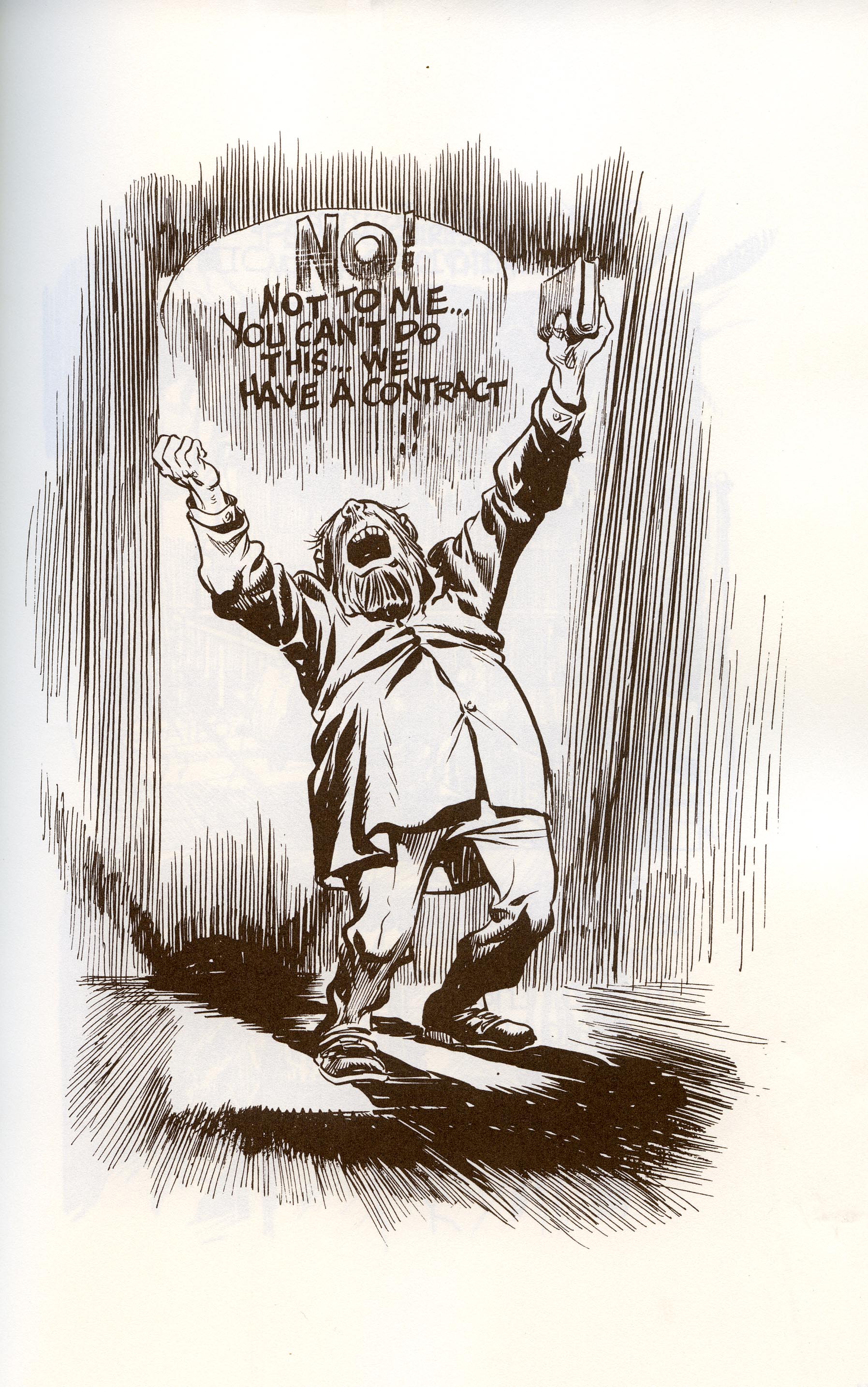
     Eisner abandoned borders and boxes, instead of traveling from one frame to the next across the pages, one image can take up an entire page. A lot of times, images are loosely arranged, one over another. Without lines and boxes, the story flows naturally. Sometimes, it evens seems like watching a movie, a scene fades into the next. Rather than having a cut in between which stopped one scene to begin a new one, the fade made the scenes intertwined with one another. Text also merge within the images, becoming part of the art. How Eisner composed A Contract with God is very unique, it had, in a way makes me feel more involved with the story.

     Dialogues of the characters have been reduced, we are not communicating as much with the characters. Instead, the plot relies more on narration. Without looking at the images, the readers can understand the story based just on the text. It indeed is just a narrative, but accompanied with images.

     In this book the page are not compacted with informations, because there are no limites on page numbers what so ever. We are given more room to "back up" from the reading, so we don't have to stare at the tiny little boxes trying to figure out what's going on. Comic can be overwhelming sometimes due to how "crowded" they are. The style of Contract with God is much more pleasing to the eyes. In fact, I think it's a much more enjoyable piece for Eisner too.